How to Create a Smooth and Memorable User Experience
Discover the secrets of an exceptional UX that transforms your visitors into loyal customers.
User experience is no longer just an aesthetic detail : it's the determining factor that transforms a visitor into a loyal customer. In a digital world where attention is measured in seconds, creating a smooth and memorable experience becomes your decisive competitive advantage.
The numbers are clear : 88% of users never return to a website after a bad experience (source : Sweor User Experience Study 2024). Conversely, exceptional UX can increase your conversions by 200% to 400% according to studies in web ergonomics and interaction design.
In this comprehensive guide, discover proven methods to design a user experience that captivates, converts and builds loyalty.
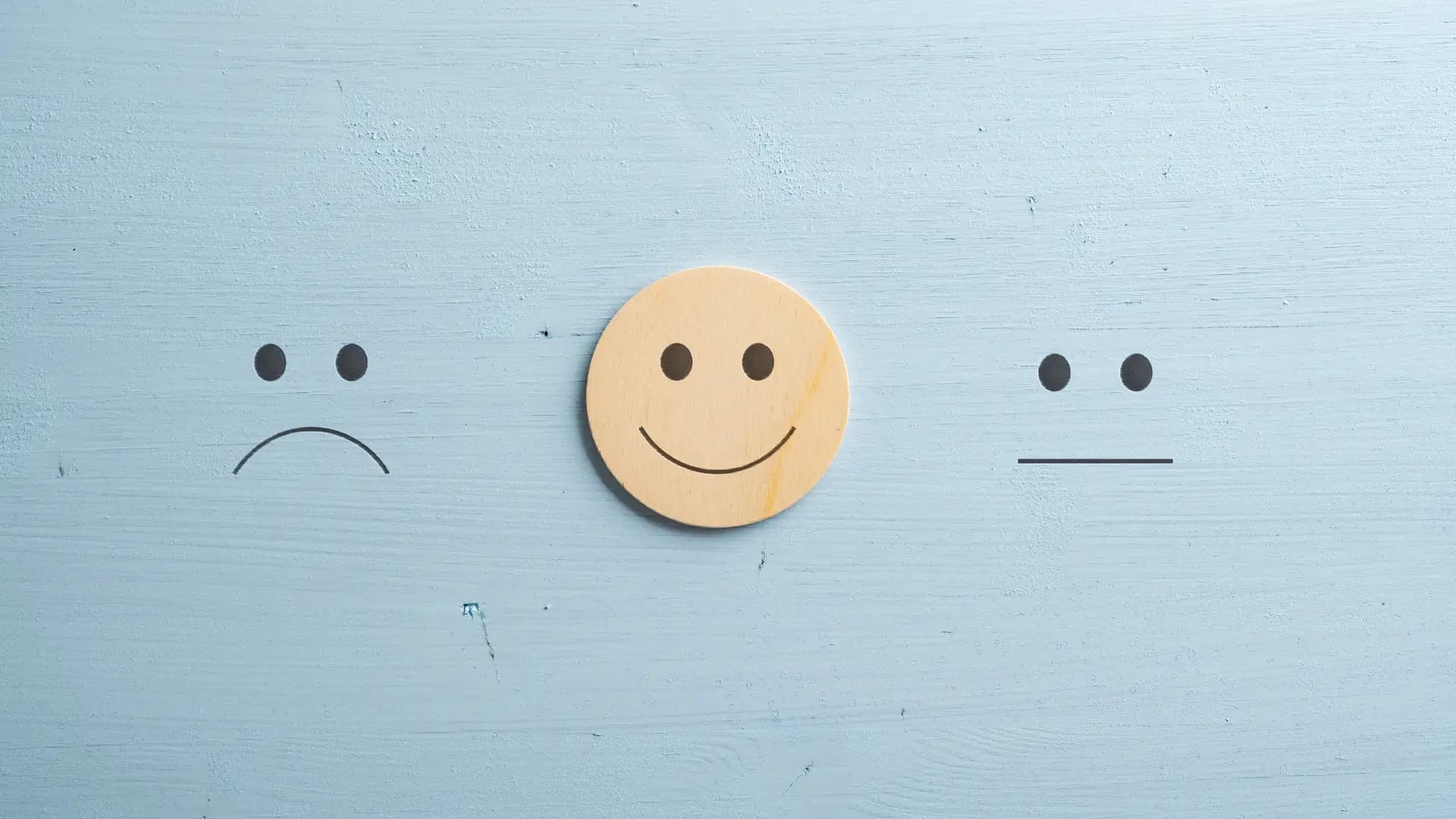
What is a truly smooth user experience ?
A smooth experience isn't just about a website that works. It's a subtle orchestration of elements that create a frictionless, intuitive and pleasant journey.
The 5 pillars of smooth UX
1. Immediate intuitiveness
Your users must instantly understand how to navigate and where to find what they're looking for. No confusion, no questioning. The interface speaks for itself.
2. Speed of execution
Every action gets an instant response. No waiting, no endless loading. Speed becomes transparent, the user doesn't even notice it anymore.
3. Perfect consistency
The same actions produce the same results everywhere on your site. Similar elements behave identically. This predictability reassures and facilitates learning.
4. Universal accessibility
Your site works perfectly on all devices, for all users, regardless of their abilities. The experience adapts to everyone, never the other way around.
5. Anticipation of needs
Your interface guesses what the user is looking for and offers smart shortcuts. Information appears at the right time, in the right place.
The invisible foundations of memorable UX
A memorable experience is built on solid technical and psychological foundations that the user doesn't see, but feels deeply.
Information architecture : the invisible skeleton
Before any layout, the logical organization of your content determines the fluidity of the journey. A well-thought-out architecture makes information accessible within 3 clicks maximum from any page.
Principles of good architecture :
- Clear hierarchy : information structured from general to specific
- Intuitive categories : logical groupings that match users' mental model
- Consistent navigation : menus and links present predictably
- Path of least resistance : direct access to priority actions
- Breadcrumb trail : the user always knows where they are
Cognitive psychology applied to UX
Our brain processes information in specific ways. Leveraging these psychological mechanisms enables naturally smooth experiences. Hick's Law teaches us to limit choices (5-7 options max) to speed up decisions. Fitts's Law explains why important buttons should be larger and more accessible. The Zeigarnik Effect shows that progress indicators motivate completing a journey. These principles, applied judiciously, transform a functional interface into a naturally intuitive experience.
User journey : mapping to optimize
Understanding precisely how your users navigate reveals opportunities for improvement and friction points to eliminate.
Journey mapping method
Effective mapping requires a methodical 3-step approach :
User journey mapping process
Define personas
Identify and document your typical users with their goals, motivations and constraints. Create 3-5 personas based on real data (analytics, CRM, interviews).
Define personas
Identify and document your typical users with their goals, motivations and constraints. Create 3-5 personas based on real data (analytics, CRM, interviews).
Analyze emotions
Observe and understand what the user feels at each moment : frustration, satisfaction, confusion, joy. Use user testing and tools like Hotjar.
Analyze emotions
Observe and understand what the user feels at each moment : frustration, satisfaction, confusion, joy. Use user testing and tools like Hotjar.
Identify opportunities
Spot friction points to eliminate and improvement opportunities to exploit. Prioritize according to business impact.
Identify opportunities
Spot friction points to eliminate and improvement opportunities to exploit. Prioritize according to business impact.
Most common friction points
Certain obstacles systematically recur in user journeys. Identifying and eliminating them generates immediate conversion gains.
Top 10 frictions that kill conversion :
- Forms that are too long : beyond 5 fields, abandonment rate explodes
- Intrusive pop-ups : interrupting the user generates 95% frustration
- Confusing navigation : not finding information within 3 clicks = abandonment
- Loading time : each second costs 7% of conversions
- Complex checkout process : 69% cart abandonment in e-commerce
- Lack of feedback : the user doesn't know if their action worked
- Technical jargon : incomprehensible language for average users
- Non-optimized mobile : 57% of mobile users leave a non-responsive site
- Lack of reassurance : absence of social proof and guarantees
- Ambiguous calls to action : poorly visible buttons or vague labels
Emotional design : creating memorability
Beyond functionality, a memorable experience touches users emotionally. This emotional connection transforms an ordinary visitor into a brand ambassador.
The 3 levels of emotional design
Don Norman, father of UX design, identifies three levels of emotional interaction that every experience must orchestrate.
Visceral level : first impression
This is the instinctive, immediate reaction to visual elements. Colors, shapes, animations create an instant emotion before any thought. Polished design, quality visuals, elegant typography generate immediate attraction.
Behavioral level : the usage experience
This is the pleasure (or frustration) felt during use. Fluidity, responsiveness, simplicity of execution create deep satisfaction. When everything works perfectly, the user feels mastery and comfort.
Reflective level : the afterthought
This is the memory and meaning the user attributes to the experience. The story told, values transmitted, identity projected create lasting attachment. This is what transforms a customer into a fan.
Emotional design techniques
Concrete methods allow integrating emotion into every interaction.
Delightful micro-interactions
These small animations that respond to user actions create moments of joy. A button that reacts on hover, an animated confirmation, an original loader transform a mundane action into a pleasant moment.
Concrete examples :
•"Like" button that beats like a heart
•Confetti animation upon validation
•Playful progress bar with encouraging messages
•Personalized illustrations according to state (empty page, error, success)
•Subtle sounds confirming important actions
Emotional personalization
Adapting the experience to the context and user history creates a personal connection.
Practical applications :
•Personalized welcome message with first name
•Recommendations based on past preferences
•Congratulations for anniversaries or milestones (1 year of loyalty)
•Content adaptation according to time ("Good morning" vs "Good evening")
•Preference memorization (language, dark theme, etc.)
Technical performance : the invisibility of excellence
Smooth UX relies on solid technical foundations. Performance isn't just about speed : it's the elimination of all technical friction.
Performance metrics that matter
Google defines Core Web Vitals as essential indicators of successful technical experience. Each metric measures a critical aspect of user perception.
| Metric | What it measures | Excellent threshold | UX impact |
|---|---|---|---|
| LCP (Largest Contentful Paint) | Display time of main content | < 2.5 seconds | Perception of loading speed |
| FID (First Input Delay) | Responsiveness to first interaction | < 100 milliseconds | Sensation of fluidity and control |
| CLS (Cumulative Layout Shift) | Visual stability during loading | < 0.1 | Avoids frustrating accidental clicks |
| INP (Interaction to Next Paint) | Overall page responsiveness | < 200 milliseconds | Perceived interaction fluidity |
| TTFB (Time To First Byte) | Server response speed | < 600 milliseconds | Foundation for all other optimizations |
Essential technical optimizations
Optimized images : Images represent 50-70% of a page's weight. Use WebP (30% lighter than JPEG), implement lazy loading and serve sizes adapted to each screen with srcset. These three optimizations alone can divide loading time by 3.
Clean code : Minify CSS/JS/HTML, eliminate unused code (tree-shaking) and load non-critical scripts deferred (defer/async). Clean code is fast code that directly improves user experience.
Accessibility : inclusion as standard
A smooth experience for some only isn't a true smooth experience. Accessibility ensures no one is left behind.
Beyond compliance : profitable accessibility
Accessibility isn't just a legal obligation : it's a measurable business advantage. 15% of the world's population lives with a disability (source : WHO Disability Statistics 2024). Excluding them means giving up 15% of potential customers.
But accessibility benefits everyone : subtitles help in noisy environments, high contrast facilitates reading in bright sunlight, keyboard navigation speeds up power users.
Essential accessibility checklist
Sufficient contrast
•Minimum ratio 4.5:1 for normal text
•Minimum ratio 3:1 for large text (18pt+)
•Testable with WebAIM Contrast Checker
Keyboard navigation
•All functions accessible without mouse
•Logical and predictable tab order
•Visible focus on active element
•Keyboard shortcuts for frequent actions
Screen readers
•Semantic HTML tags (nav, main, article, aside)
•Descriptive alt texts for images
•Explicit labels on forms
•ARIA when semantic HTML isn't sufficient
Multimedia content
•Subtitles for videos and audio content
•Text transcripts available
•Audio descriptions for complex visual content
•Accessible and understandable media controls
User testing : validate before launching
Your designer intuitions aren't enough. Only real users reveal the actual frictions in your interface.
Effective testing methods
User testing : Directly observing 5-8 users interacting with your site reveals 80% of problems. Their hesitations, facial expressions and spontaneous comments unveil what no analytics can show. Use the "think-aloud protocol" and realistic scenarios to understand the "why" behind each action.
Recommended tools : Hotjar for session recordings and heatmaps, UserTesting for tests with user panels and Maze to validate your prototypes with automatic metrics.
A/B testing : Test two versions to objectively identify the most effective one. Prioritize headlines, calls to action, forms and conversion paths. Data always beats opinions.
Measure and optimize continuously
UX is never finished. Continuous improvement based on real data transforms a good experience into an excellent one.
UX metrics to track religiously
| Category | Metric | How to measure | Benchmark |
|---|---|---|---|
| Effectiveness | Task success rate | % users completing desired action | > 80 % excellent |
| Efficiency | Time to complete a task | Average duration of complete journey | < 2 minutes for simple conversion |
| Satisfaction | NPS (Net Promoter Score) | Post - interaction survey (0 - 10) | > 50 excellent |
| Engagement | Pages per session | Google Analytics | > 3 pages good |
| Conversion | Overall conversion rate | Google Analytics goals | > 3 % e - commerce, > 5 % services |
| Friction | Form abandonment rate | Analytics form events | < 20 % excellent |
Continuous optimization cycle
Adopt an iterative process that transforms data into concrete improvements.
1. Measure : collect quantitative data (analytics) and qualitative (tests, surveys)
2. Analyze : identify patterns, recurring problems, improvement opportunities
3. Hypothesize : formulate optimization hypotheses based on data
4. Test : implement solutions and measure their impact (A/B test)
5. Deploy : generalize statistically validated improvements
6. Repeat : optimization has no end
Practical cases : UX before/after
Concrete examples illustrate the transformational impact of rethought UX.
Case 1 : Fashion e-commerce - Cart abandonment reduction
Initial problem :
•Cart abandonment rate : 82%
•Order process : 7 steps
•Form : 23 required fields
•No progress indication
UX optimizations :
•Reduction to 3 steps (cart → delivery → payment)
•Form condensed to 9 essential fields
•Clear and encouraging progress bar
•Address auto-completion and saved payment
•Summary always visible on the side
•Quick modification without going back
Measured results :
•Cart abandonment rate : 82% → 54% (-34%)
•Order time : 8 min → 3 min (-62%)
•Conversion rate : +147%
•Monthly revenue : +€89,000
Case 2 : B2B SaaS - User onboarding
Initial problem :
•68% of users don't reach first key action
•Empty and intimidating dashboard
•Features not discovered
•D+7 retention rate : 23%
UX optimizations :
•Progressive onboarding in 5 guided steps
•Pre-loaded demo data
•Contextual tooltips on main features
•Progress checklist with gamification
•Virtual assistant offering proactive help
•Short videos (30s) explaining each function
Measured results :
•Onboarding completion : 32% → 79% (+147%)
•Time to first action : 45 min → 8 min (-82%)
•D+7 retention rate : 23% → 67% (+191%)
•Support reduction : -43% beginner tickets
UX errors to absolutely avoid
Some practices destroy user experience despite good intentions. Learn from others' mistakes.
UX errors that kill conversion
- ❌ Neglecting mobile: 60% of traffic is mobile, optimize for smartphone first
- ❌ Sacrificing performance: each second of loading costs 7% of conversions
- ❌ Unnecessary complexity: simplicity always beats technical sophistication
- ❌ Neglecting accessibility: excluding 15% of your audience is never justified
- ❌ Lack of consistency: each inconsistency generates confusion and loss of trust
- ❌ Never testing or measuring: your intuitions are often wrong, validate with data
Conclusion : UX as sustainable competitive advantage
User experience is no longer an aesthetic or technical detail. It has become the major differentiator in a market where products and services increasingly resemble each other.
The 5 pillars of exceptional UX :
- Intuitiveness : the user understands instantly without thinking
- Fluidity : no friction slows down or blocks the journey
- Performance : invisible but essential speed and responsiveness
- Emotion : connection that transforms experience into memory
- Continuous improvement : optimization based on data and tests
UX return on investment is undeniable : for every euro invested, you get back between €2 and €100 according to studies in web ergonomics and interaction design. More importantly, exceptional UX creates a competitive advantage that's hard to copy.
Your competitors can copy your features, prices, marketing. But they can't copy the emotion and fluidity of an experience carefully orchestrated for your specific audience.
Excellence in UX isn't a one-time project, it's a company culture. Organizations that place the user at the center of all their decisions dominate their market.